Photographing still life with the Elinchrom App
Still life photography is a fantastic way to learn more about the fundamentals of lighting and photography.
Quentin Decaillet shares a recent portfolio shoot and makes us understand what role software like the Elinchrom App can play in his creative process.
When I moved into my first studio in 2014, I began working on still life, portrait, and beauty photography simultaneously. In that time, I quickly realized how much there is to learn about lighting from still life and how much it taught me about the technical aspects of photography.
In this article, I’ll go through a recent shoot I did for my portfolio using the Elinchrom ELC 125 and 500, as well as the Elinchrom iOS App.
Finding inspiration at the supermarket
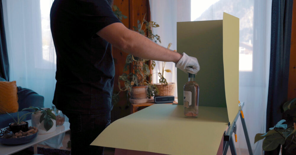
When shooting still life for my portfolio, I like to walk around stores and supermarkets until I find a product I feel could be interesting for my portfolio and inspire me. I bought the gin bottle for this shoot while grocery shopping at my local supermarket and thought it would work well with a simple monochromatic backdrop. I bought a few paper sheets in both green and pink to have choices on set.
A set, step by step
I tend to create my sets step by step. For this shoot, I started by placing my bottle with a glass on the paper backdrop. Looking at the scene, I quickly realized it lacked some interest; it was far from the hero shot I had envisioned.
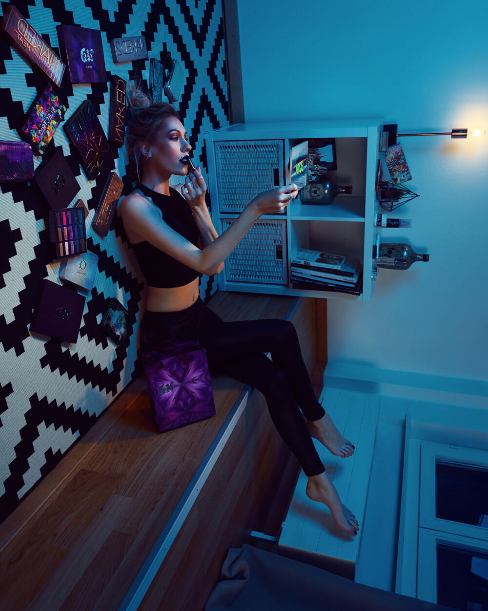
I went back to my old work and stumbled upon a shoot I did with my girlfriend a few years ago. In the final image, she had laid down on the living room floor with her legs up on a stair, so when the photo is flipped on the side, the viewer can’t tell if it was upside down or not.
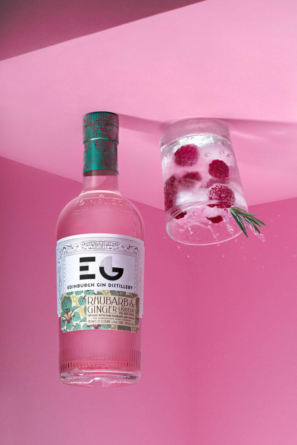
I love this kind of image as it forces you to stop and have a serious look at the whole picture to analyze what’s going on. I decided to try and recreate something similar here by flipping the bottle upside down.
Getting the composition right
The set was starting to take shape, and I could then start thinking about my composition.
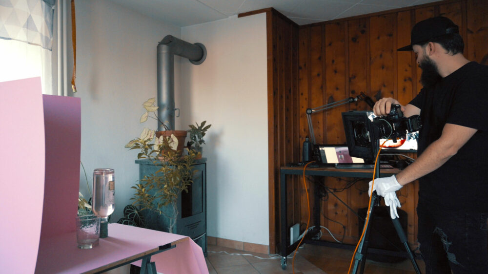
I used my Nikon D810 tethered to my computer and Capture One to use the Live View mode. Having a direct view of my composition on a large screen makes the process much more streamlined than going back and forth between the camera and the set. No need to take a shot to see what the set looks like either.
Creating with one light at a time
Even though still life is a very technical genre, that is not a reason to add tons of flash units on the set. I like to build my set one light after another and give them each a particular purpose.
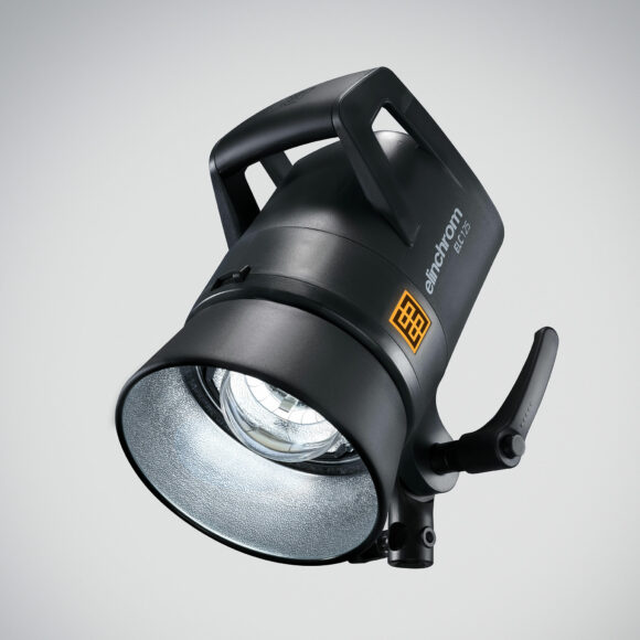
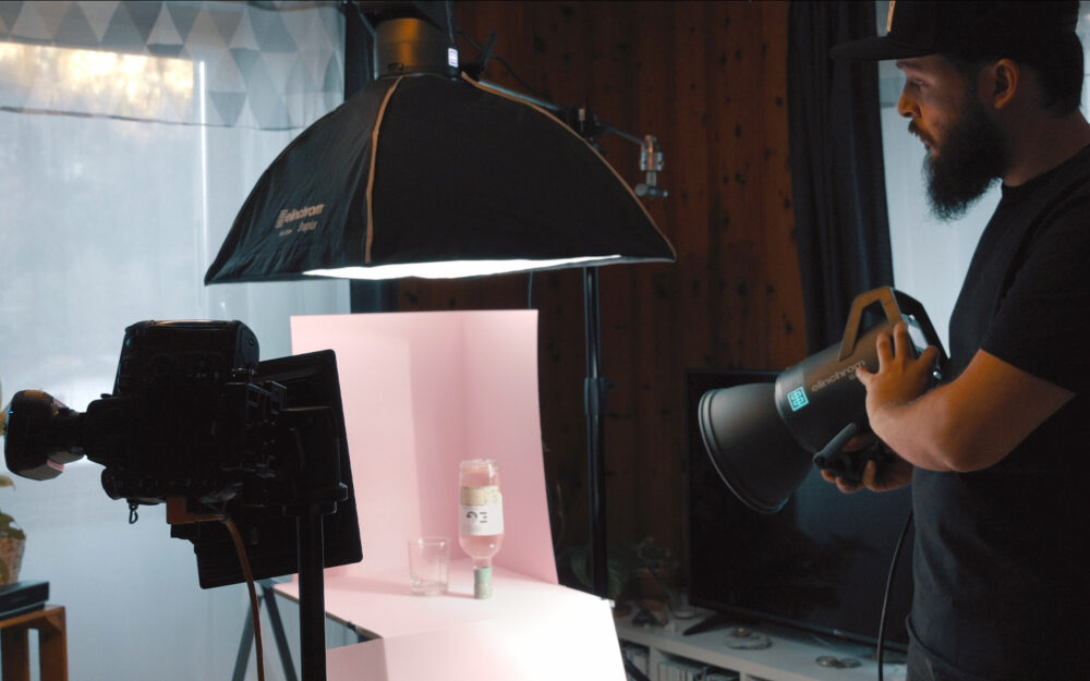
The first light I used in this instance was an Elinchrom ELC 125. When adding the first light, I switch it on, walk around my set with the unit in my hand, and the modeling light on. The modeling light allows me to see where the strobe would be the most useful for my concept without triggering and moving it numerous times.
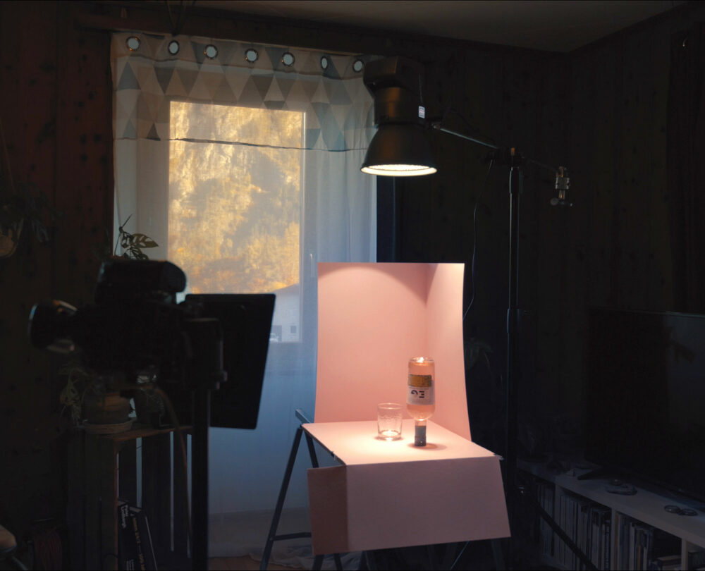
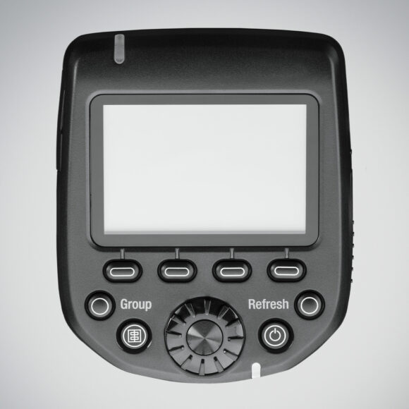
For my upside-down set, I decided to boom the Elinchrom ELC 125 and light my elements from above. It created a nice overall fill. I then switched my Transmitter Pro into TTL mode to get a first exposure reading, took a shot, and switched back to manual mode to further refine the power settings.
TTL is not a perfect solution, but it’s a fantastic tool to get an approximate starting place.
When shooting still life,
I don’t want to risk moving anything by accident.
The Elinchrom App
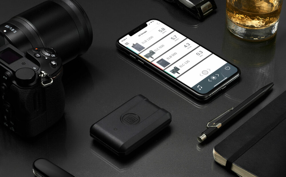
With the Elinchrom Transmitter Pro back into Manual mode, I didn’t have to touch my camera or transmitter anymore, thanks to the Elinchrom Studio App and Capture One Pro.

I can rely on the latter to trigger my camera, and the Elinchrom Studio App enables control of the flash units from my iPhone.
This combination is beneficial when shooting still life because I don’t want to risk moving anything by accident, especially my camera, which would affect my framing. As it’s quite common in post-production to use multiple images to create a composite, any minor movement would make the whole process much more complicated.
With the Elinchrom Studio App and Capture One, my camera and strobes’ control is at my fingertips. The combination dramatically streamlines my process and enables me to work without an assistant.
Choosing the right modifier
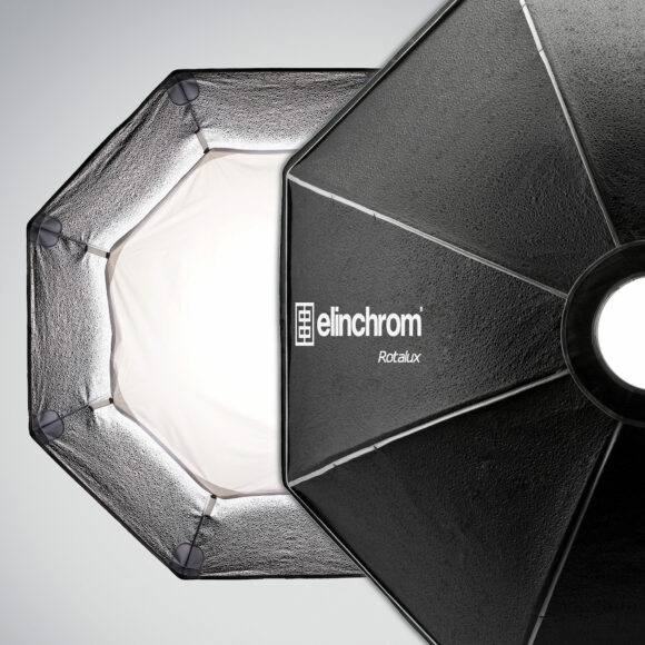
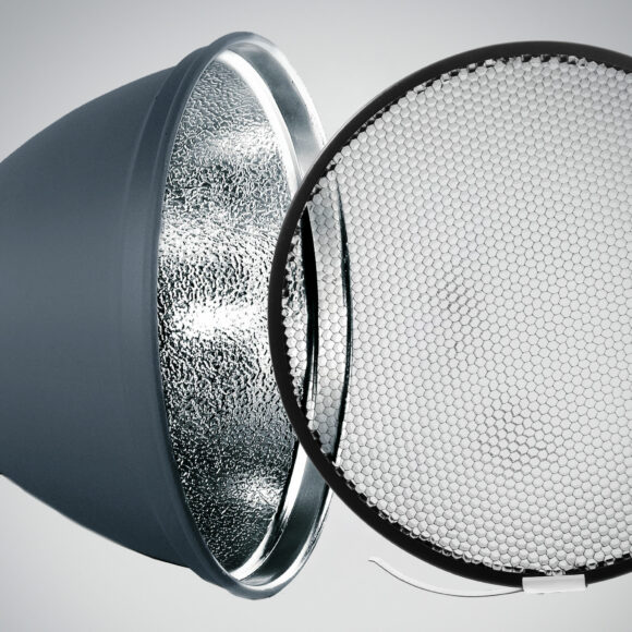
The 21 cm standard reflector I had on my ELC 125 was doing an excellent job creating a hard light, but it wasn’t exactly what I had in mind. A softer light from above would fit the mood of my concept much better. So I replaced the reflector with an Elinchrom Rotalux Recta. Its size relative to the bottle was large enough to create a beautiful soft light on the whole set. Using the Elinchrom Studio App, I could adjust the power of the ELC 125 as the Rotalux doesn’t offer the same light efficiency as the reflector. The app truly comes in handy in this scenario using a flash unit on a boom, and the camera is either out of reach or cannot be touched.
Despite the change of modifier, the bottle still showed strong specular highlights on its bottom. To reduce the effect, I used a polarizing filter on my Nikon D810. To cut it even further, I could have used one on my light, but I didn’t have any at my studio at the shoot time.
Creating depth and shape
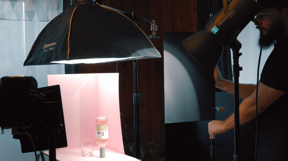
The set was good at this point but lacked depth. The bottle didn’t have enough shape. So I decided to add a second light, an Elinchrom ELC 500 this time, to give more body to the bottle and the glass. As with the first light, I used a standard reflector to start with as it creates a hard light that makes it easy to see the light direction.
In this case, I felt like the hard light was working quite well. The fill light above also helped reduce the contrast slightly to avoid having the label on the bottle going from pure white to black as it does on the test shot I took with only the ELC 500.
To give more volume to the bottle and more dimension to the image, I added a flag between the ELC 500 and the set and added a 20° grid. These additions also helped me remove some of the light falling on the bottle’s label to the right side of the frame.
Tying all the elements together
With the lighting on point, it was time for a bit of styling to tie all the elements together. The first thing I wanted to improve was the glass. It felt too static, being flat on the table. So I decided to raise one side using a piece of a kneaded eraser. This way, it looked more as if it just dropped or was spinning.
The glass being empty also doesn’t work well at all. So I filled it with tonic, a few ice cubes, and to make it fancier, I added a small branch of rosemary and a few strawberries. All elements remained within my image’s color palette, which was essential to making the image aesthetically pleasing.

Getting the shot done
Looking closely at the image, it’s quite apparent that not everything is sharp, despite shooting closed down. It’s very common in still life and product photography to stack multiple shots in post-production to increase the depth of field – this is what we call focus stacking. To take these shots, I always make sure that:
- The Flash units are not in Action mode, so I have a more stable white balance from photo to shot;
- The recycling mode is set to fast or normal to make sure the units recycle fast enough in between two pictures – you can define the time between two images with most cameras and software that automate the process.
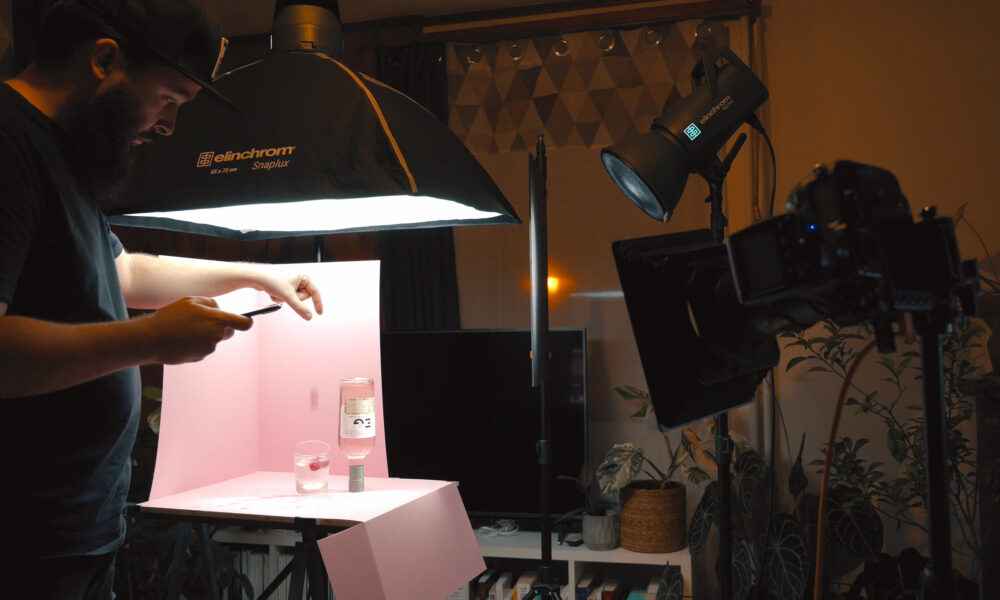
Once I took the photos I needed to create my focus stack, I wanted to take a few additional images with strawberries and ice cubes dropping into the drink. This way, I would have the option to add more movement in the final shot and make the upside-down feel and the glass movement more believable.
I switched both ELCs to Action mode, adjusted my focus to the glass, and took these additional images.
Creativity first
I hope this shoot inspired you to give still life a try. What’s great about product photography is that you don’t need a lot of space to shoot and when starting out it’s a fabulous way to learn and understand light better – especially as the subject doesn’t move, you can try different setups and compare easily.
Also be sure to install the Elinchrom Studio App – available on both iOS, macOS, and Windows – and experiment with it. At first, I was doubtful it would help me in my daily workflow, but today I couldn’t imagine working without it. It simplifies my work on set. I can control my flash units from my iPhone, the interface is more user-friendly than the Transmitter Pro, and when shooting similar setups day in and day out, I can save and load the flash settings to get a constant result every time!
The Elinchrom Studio App is one of the modern photographic tools that allows you to make the technical aspect of photography easier and concentrate on the most important aspect of it: expressing your creative vision.

