Lighting & editing for cinematic portraits
Inspired by the look of classic films, you can find this type of lighting used everywhere, from ad campaigns to the covers of fashion magazines.
Though it may seem intricate and daunting, achieving this look isn’t as complicated as you might think!
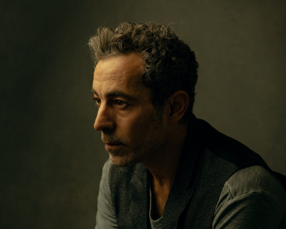
Creating moody and cinematic portraits is something photographer Elisha Knight has down to a science.
In this video tutorial, Elisha breaks down her approach with easy-to-replicate lighting set-ups and color toning processes. With a few helpful tips and tricks to keep in mind along the way, it’s sure to help you add a classic film flair to your next portrait session.
What means “cinematic portraits”?
A cinematic portrait can look like anything!
To me, it’s all about telling a story through your subject while using thoughtful lighting, color, and composition. I’m drawn to images that tend to be darker and dramatic, which is often labeled as cinematic.
Natural light isn’t ever just a single color
I’ve recently started to mix color temperatures to mimic natural light. Natural light isn’t ever just a single color. If you think of window light, you have warmer tones coming from the sunlight and cooler tones from the sky and grass or concrete. It’s something I am still experimenting with, but mixing color temperatures adds a nice dimension to your light.
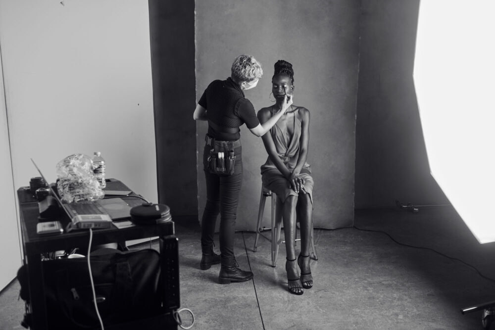
“My personal style has developed over a long time.
Patterns start to emerge as you follow your instinct more and more.”
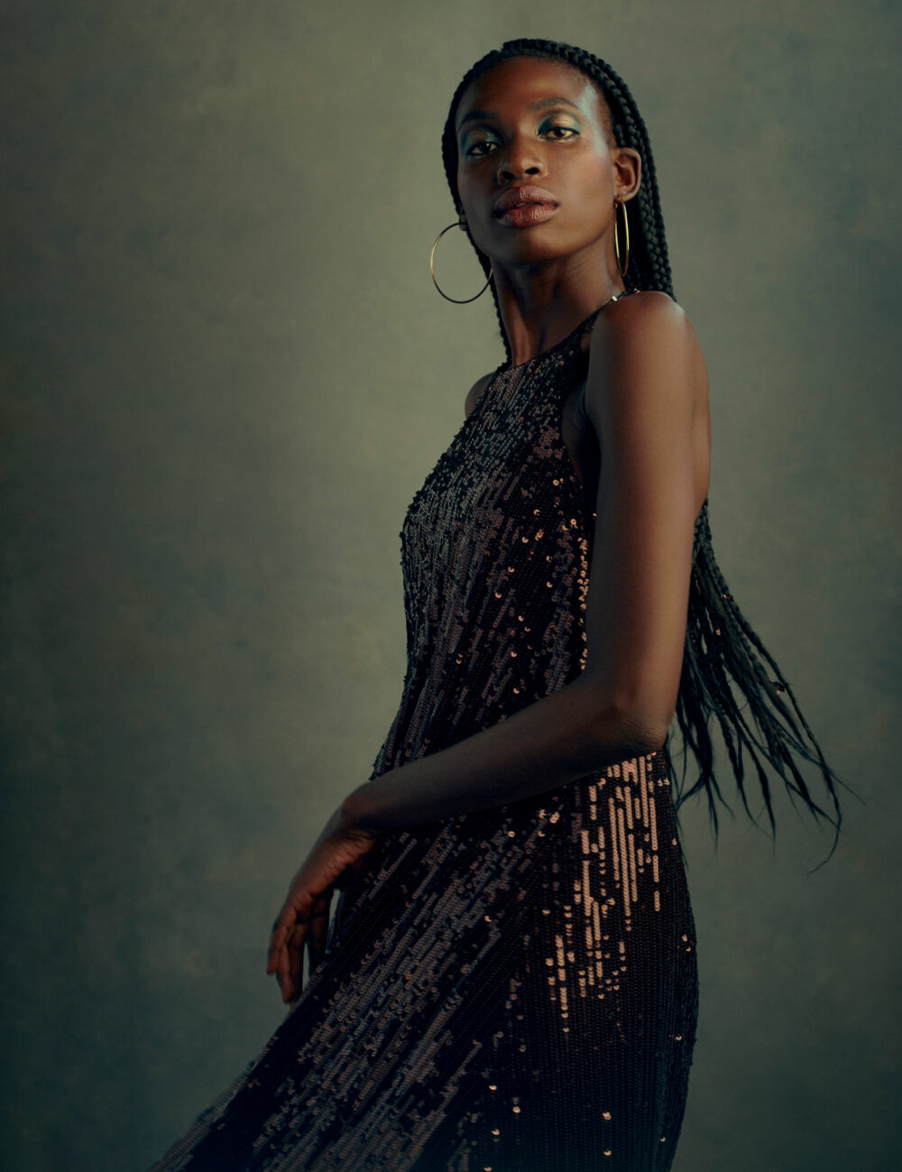
Keep trying different things
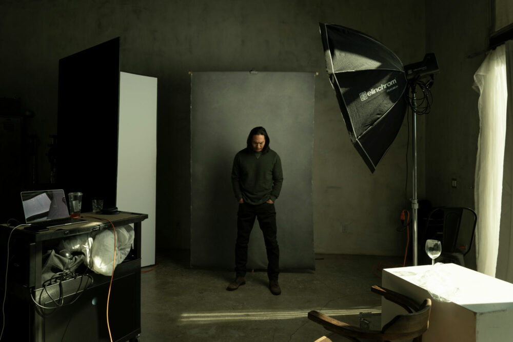
I got pretty bored with the usual one-light setup I used and wanted to experiment with ways to elevate that simple setup. I just kept trying different things with the modifier, like slightly pulling off the diffusion to get a couple of different light qualities from one source.
I also started using things like tissue paper, wine glasses, or a plastic bag in front of the lens to get some interesting blur or glow effects in-camera.
It’s been a fun way to breathe new life into my work!.
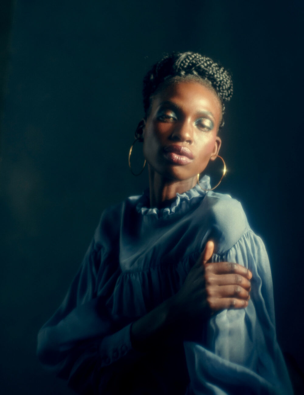
Iconic yet subtle light
The techniques I use in the studio can be used on-location as well. Often, I go into a shoot and try to mimic and enhance the lighting in the room I am in, whether on a backdrop or not. The same applies when outdoors in the sun. I usually block the sun off the subject using whatever light and modifier I am using as my key and make the intensity something natural.
Annie Leibovitz is a huge inspiration. Her lighting is iconic yet subtle. It’s something you appreciate more as you gain experience. I love how she can capture such genuine expressions within such a stylized portrait.
My personal style has developed over a long time. Patterns start to emerge as you follow your instinct more and more.
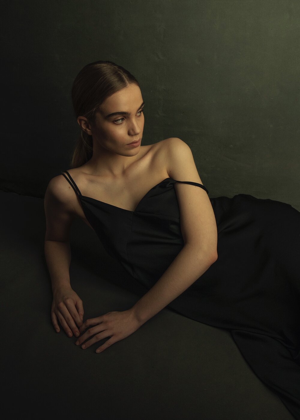
Colors
Color has played such a huge role in my work since the beginning. The direction I choose to take a color grade depends entirely on what is in front of the camera. Everything from the skin tone of the subject, to the wardrobe, to the makeup, to the background I choose plays a role.
Over time I have developed a handful of foundational color profiles. They are presets that work as a great way to try different looks quickly, and once you find one, build from there.
If anyone is interested in these foundational presets, I sell them over on my website!
Start simple
For those of you who are just starting your studio lighting journey, keep it simple. Start learning how to master one light and experiment from there.
Lighting should be fun so enjoy it!!

